
Viking CMS in pictures
Explore the editing, design and migration tools in Viking CMS. These screenshots show the browser interface; the content and settings shown are examples. Start with the site owner guides to try the workflows, or return to Viking CMS.
The editing workspace

Viking CMS in action. Pages and site tools sit on the left, the editable website occupies the centre, and design controls sit on the right. The top bar provides responsive previews, draft saving and whole-site publication. The publication panel shows the active release and rollback control. Start your first site.
Two ways to create pages

Markdown editor. Write with familiar formatting controls or edit the source
directly. Upload and download .md files, choose a page layout and set menu
placement. Write a Markdown page.

Visual page toolbar. Choose a layout and menu position, then work on the canvas with undo, redo, duplicate, parent selection, delete, source and fullscreen controls. Build a visual page.
Blocks for building a page
| Basic content | Page structure |
|---|---|
 |
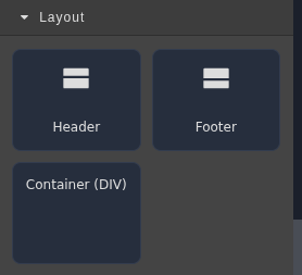 |
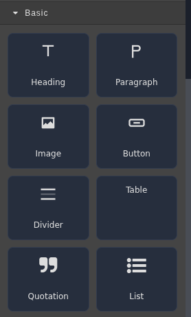
| Basic HTML blocks add everyday content such as text, images, buttons and tables. | Layout blocks provide headers, footers and containers to organise a page or template. |
| Ready-made sections | Site content |
|---|---|
 |
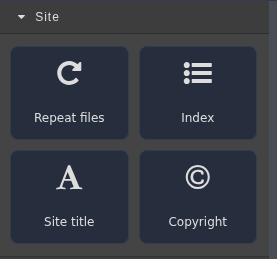 |
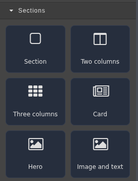
| Section blocks give you a starting point for columns, cards, heroes and image/text arrangements. | Site blocks insert generated page indexes, repeated listings, the site title and copyright text. |
Drag blocks onto the canvas, then edit their text and appearance. Learn about pages, indexes and repeated cards.
Fine-tune the result
| Layers | Styles | Properties |
|---|---|---|
 |
 |
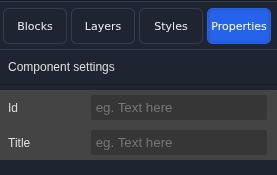 |
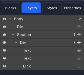
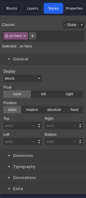
| Layers navigator helps you select elements within a nested layout, including hard-to-reach parents. | Styles editor changes classes, spacing, typography, dimensions and other visual settings for the selection. | Properties editor changes the selected component's attributes; the available fields depend on the block. |
The same design tools support custom themes and shared templates.
Bring content and tools with you

WordPress import. Choose a WXR export or read-only database source, inspect it, and review the import plan before creating Markdown drafts. The draft/private content option lets you choose whether to include unpublished WordPress entries. Follow the migration steps.
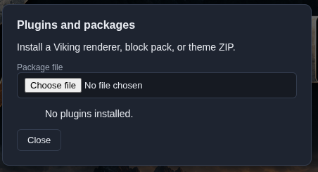
Plugins and packages. Install a local ZIP containing a renderer, block pack or theme. Select or apply the installed content, then publish when ready. Use downloads and packages.